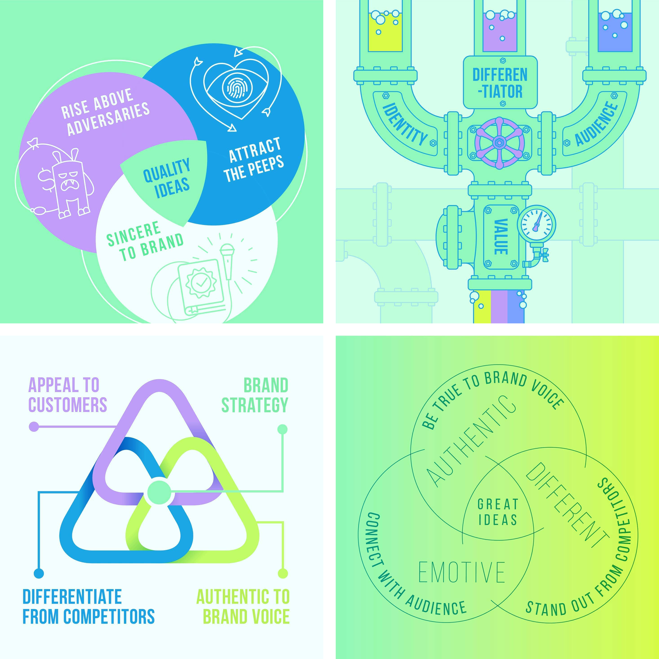
“I hate your infographics” said the CEO
The moment I fell in love with data visualization
Early in my career, I had the opportunity to work on a brand that required months of deep diving into complex scientific concepts. It was one of my first true experiences art directing, and I poured everything into it. Especially when it came to designing the infographics for an investor deck. I knew they had to communicate intricate technology in a way that was clear, digestible and compelling. I felt confident in my approach.
Then, the CEO pulled me aside.
"Ona, I have to be honest with you, I hated the infographics you designed for this project. I’ve spent years explaining the key technology behind our innovation, and to me, they felt... oversimplified."
My stomach dropped. But before I could even process my impending doom, he continued:
"But I’ve received nothing but great feedback from my investors. They’ve told me how much easier it is to understand the science. They FINALLY get it. And that’s what matters. So, I wanted to personally thank you. Your work has given me the momentum I needed to continue attracting new investors."
This experience left a huge impact on me
The CEO had trusted the process, even when he didn't fully believe in it at first. And I had unknowingly proven something to myself: Data visualization wasn’t just about making things simple and look good, it was about making them work. It was about distilling the complex into the accessible, transforming dense information into something people could engage with, understand and act upon.
That’s when my love for infographics was born.
Over time, I realized that my passion for data visualization comes from the same place as my love for logo design. Both require the ability to take something complex and distill it down to its purest, most effective form. Just as a logo encapsulates the essence of a brand in a single mark, an infographic has to translate intricate ideas into a visual that instantly makes sense to its audience.
In both, simplicity is not about losing meaning, it’s about making meaning stronger.
Since then, I’ve embraced every opportunity to refine the way I visually communicate ideas, especially when the subject matter is technical, nuanced or deeply layered.


